Tuesday, March 10, 2009

obama <3s graphic design and vice versa

Obama's team unvieled two new logos this week:

I read about them in a post by Steven Heller, a well known graphic designer (and professor at SVA) here at the New York Times Moment Blog, which has different writers each week- a few weeks ago the same blog featured Sagmeister, a real great designer as well. Nothing much to say about this, but I wanted to post them up. Hopefully I'll type up a few recent design-related writings that I did for class, they are handwritten right now (I know, how 90s of me).

Saturday, March 07, 2009

papermaking project ideas

I need to work out some ideas for a papermaking project, involving watermarking and silkscreening. The image needs to be multilayered- with each layer interacting in an appropriate or ironic way. I.e. a picture of george bush making a speach- when held to the light, reveals a speach bubble with the word 'LIES' in it. This is a little more direct and in-your-face then I want to be but illustrates the possibilities. Another layer may be something which I have not tried yet- but there is an ink which mixes with other colors to make them glossy and Kevin, my instructor, says that you can silkscreen straight gloss and put an image that is only visible in a certain light- just like the watermark. This glossy image can be the same as the watermark, which would emphasize the image, or it can be yet another layer in the project.
Content ideas:
-the silkscreen image is a body or a face, with a watermarked image of a skeleton or skull. I would have the become much better at making watermarks and play around with the pulp to make a perfect porportion for watermarked paper. A skeleton may be too detailed, but a skull or a part of a skeleton may be doable.


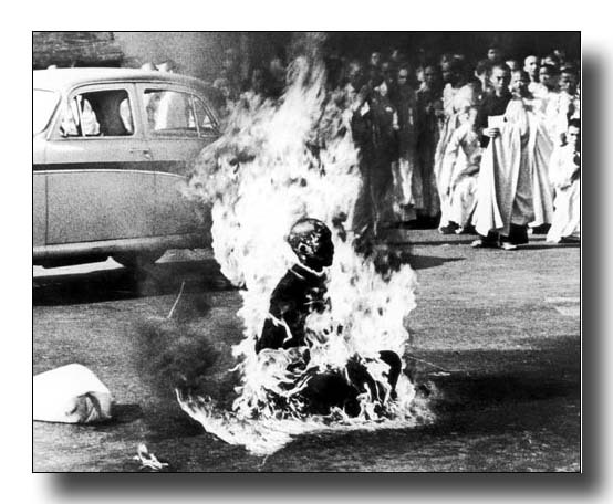
-an image of self-immolation, a monk setting himself on fire, and a watermark image of his soul rising or some other way to emphasize what it means to give your life.
-this much black might make the watermark hard to see, which can corrected in a few ways: use a semi-transparent black or another color completely. or 'back up' the watermarked image with a glossy image on top


>another problem: how to cut down the watermarked paper so it is perfectly aligned, which will matter when I try to silkscreen on top of it.
-idea: make a key with the monk image and the outer lines of the page marked off. On a lightboard, place this image on top of a sheet- lining up where the watermark should be seen. Trace the watermark onto the page in pencil, then put the page underneath the handmade paper and align- then trace the paper edges onto the handmade paper and cut it down. Continue by placing each handmade sheet on top of the monk image, align, trace paper edges, and cut down. Is there an easier way?

more on this later

Thursday, February 26, 2009

The Wolrd of Small Ads

The World of Small Ads, a book by Mario Lippa & David Newton:


Wednesday, February 25, 2009

Obamafied

Right in line with my post about design and the common good, check out the new website by the Obama crew: www.recovery.gov - its a website devoted to explaining to Americans where their money is going under the new bail out bill. And would you believe it, its chock-full of fancy interactive graphics!
You can't read from this crappy picture, but it actually says "As soon as we are able to, we'll display that information visually in maps, charts, and graphics." The guys over at the AIGA are probably peeing themselves with excitement.

The obama team also redesigned the traditional whitehouse.gov to be more user friendly- it is easy to navigate and provides Americans with a chance to follow what bills he is signing, his agenda on certain issues (including more than just rhetoric!), videos of recent speeches, etc.

I found an interesting analysis of the new whitehouse.gov here.

Cool shit.

Tuesday, February 24, 2009

silkscreen ideas

I wanted to post up two silkscreen ideas, the first is this real old can of pomade (hair wax for you young folks)- it was my brother's and I inherited it and I rediscovered it recently, only this time when I looked at it, I saw how insanely weird, kind of funny, and awkward the cover is. and how well it would do as a silkscreen:
(four colors, I guess- black, light orange (background), dark orange/red (text and lips), beige (skin, shirt?), and the white of the paper.

other shots:


the second project is a photographic silkscreen, for which I have three ideas:

I could add colors if I wanted- this assignment (for a class) is to be photographic and include 5 colors, so this may not work for the assignment.

other ideas:

This might be a good one, the colors are so bold. I would need help mixing them up- but I guess it would be turqouise (wall paint), dark brown (skin), navy (shirt... or just leave it black?), orange (shorts), light brown (dirt). that sounds like alot.


this one also has good colors- light brown, dark brown, blue (shirt and sky), red, and green (bug and trees). black for the shirt? no I guess I don't need black, its part of the photographic layer.

can graphic design really help people?

I just read two articles in the same day- one was about the AIGA (the center for graphic design) and this 'manifesto' about how design can help America/the world- it was a little pretentious but has genuinely good intention and some good ideas. The other article was about how insanely difficult the FAFSA form is to fill out and how unnecessarily complex it is; how the gov't can't seem to figure out how to make it more understandable without just removing information.
And at the same time I'm reading a book on information design ('Envisioning Information' by Edward Tufte) where the author writes something like 'confusion and clutter is never the fault of the information, its a lack of good design'. I have a heard time feeling too bad for americans when compared with the problems in third world nations, for example. but it is interesting to think about how design could help third world countries- again, it sounds kind of silly. But I'm sure there are applications of it- maybe making it easier to apply to welfare or some equivalent. Design could not replace aid in any way but it could make the whole system work a little smoother- especially in third world countries that have been industrialized too fast for their own good. Helping schools become a little more standardized, making "the system" (the maaaan, that system) more navigable, intuitive, understandable. The AIGA article and a few other related documents mentions more than one past president who has embraced design a tool for social and governmental change- Nixon and Reagan are the two on the top of my head.
My professor (jackie thaw) mentioned a book or two on this topic that I might look into.