Sunday, October 24, 2010

Catching up on another round of Reader

Caught up on 530 google reader posts that I had missed. Here are some highlights:


-recycled material, fireproof, soundproof, waterproof. check it out.


Enjoy!


Tuesday, October 12, 2010

Oops... I bet someone got fired over this

Gap pulls new logo within weeks after public outcry. Article here.

There will probably be more public outcry about the gap logo this week than about poverty or war or disease... which I guess I understand - I mean, did you see that stupid blue square?

-Mark

Monday, October 04, 2010

Saturday, October 02, 2010

Corporate Web Design

I know, I know - I don't really support corporations and I also go for the Mom & Pop shop when I can - but when it comes to web design, corporate companies have the most money to sink into a good designer and they'll always have the newest technologies to back it up. So check it this who's who of corporate websites:

http://www.smashingmagazine.com/2010/08/25/corporate-website-design-creative-and-beautiful-solutions/

Design vs Art, and balancing chairs.

Web design / flash / video idea

The idea came to me while watching a video on a facebook page - the notion of a dynamic video on a static, white page was interesting. Looks a little like a window - especially when its not centered or the focus of a page (i.e. a youtube video page). Like this, but with the video showing motion its more interesting (and without the buttons around the video):

The idea is outlined here in my notebook, but its the notion of a page that looks like a straightforward webpage with an embedded video - but something happens in the video that breaks out into the page. A flood, a fire that catchs onto the type and spread across it, a person that gets out of the video and climbs up the navigation bar. I'd like to play with this idea, maybe get something up on my website. as an example. 


Wednesday, September 15, 2010

Things I like

This blog post is entitled 'Things I Like' or 'highlights from core77'. Core77 is an industrial design blog that I subscribe to but haven't caught up in a month or so until last night. So here are the ones I liked the most from the last month:

A water-top table designed as a reflection of eastern mentality towards social relationships.
Kitchen Station - mostly I like this because the dripping dish drain waters a plan. Cute.
USB Typewriter along with a host of retro-retro-fits.

A chemical-free water-based cleaning device - grease, grime, mud, scum - you name it. Did I mention no chemicals?
This Swiss scientists has invented a cheap, organically-made, flexible, lightweight and color-variable solar cell. 
Sukkah City - competition/event in Union Square. Also,  a jewish tradition and holiday.
GIF images showing how simple mechanisms function - this bottom one has actually mystified me for years.
Epoxy-esque Mixed Drink
An artist/designer/inventor combines art-making and sound-making


FLAMMA from Helmut.
This guy buys a bunch of basic items from IKEA and starts a fire without matches, a lighter or even flint. The idea is neat, and the concept is even neater. The notion of starting a fire in the wild with only the basic items you can find around you is transformed in today's urban environment where its easier to find crap from IKEA than sticks, stones and strong rope-like vines.


Tuesday, September 07, 2010

A day in the city and some thoughts on design...

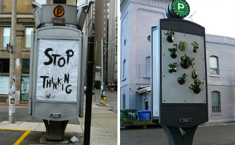
The aesthetics aside, this anti-elevator elevator graphic is an interesting idea. Obviously they have their target audience not only right in front of them but waiting there with nothing to do. Would have been more convincing if they had a sign towards the staircase - which was difficult to find. 


Not sure that I like this, but it was worth taking a photo of. 


High end yogurt, you can tell by the design (and the price)


There is something unhealthy about this. Not just water that can help you sleep - but selling it in the same spot as Red Bull. Drink this to make you hyper, then drink to calm down. Ignore what your body is telling you completely and buy more stuff to make it do what you want. Why people differentiate so much between what 'they' want and what their bodies want is a mystery to me.


On a light note - a sky-high remnant from a better time, where a sign implied a sign painter. I'm sure it was a dangerous job to get up there and paint... but we lost a human touch when we started sending everything to a printer (digital printer, to be clear - printers, as in printmakers, are alright in my book). 


Its tough to see in the picture, but if you look in the sky - its a cloud! no, its a puff of smoke! no - its an advertisement! ... really? Yes - I couldn't actually read it (doesn't say much for its purpose as an advertisement) but it might have been for Geico. It did not make me want to by car insurance. It made me want to move to Toronto (see my last post). 


Reason #246...

Why I might actually move to Toronto some day:

"Last year, Toronto citizens asked themselves a question that led to an unprecedented law: Why should we have to look at so many billboards? In April 2010, the city instituted taxes and restrictions on public advertising, but some ad companies decided to break the law – and those rogue billboards were themselves subject of guerrilla action recently when activists covered them with art." -This article

Thursday, September 02, 2010

Visualizing Information and then designing it

David McCandless's TEDtalk on visualizing information is really inspiring.

Interview with Tom Geismar


An interview (of sorts) with Tom Geismar, the designer behind such logos as: Mobil, PBS, Chase, National Geographic, NYU... the list goes on and on.

http://www.logodesignlove.com/tom-geismar-interview

a sample:

Q. Can you share some advice or great stories on selling ideas to clients?

A. Logos are funny things. At first they are just designs on paper. Eventually they come to embody all the qualities of the organization they represent, and most people cannot separate the “design” from their full range of opinions about the organization. The hard task the designer faces is trying to help the client see how the logo might eventually be perceived, how it will work for them, not just whether they “like it”. We learned this lesson early on when we first presented the Chase symbol to the chief executives of the bank. The man who was then Chairman said he would go along the decision of the others, but personally he hated it and did not want to see it on his letterhead his business card, or anywhere in his office. Six months later we ran into him at the bank. He was wearing a pin with the symbol in his lapel, and a tie-tack with the symbol holding a tie that was itself a pattern of the symbol. To him, the mark was no longer just an abstract design, it had become the representation of his organization.


I thought of this first...

I guess I didn't really think of it first but I did think of it independently and I am glad that someone else had the guts to do it. Because I never would have.


http://www.npr.org/templates/story/story.php?storyId=5172177

Wednesday, September 01, 2010

How to get a design job

I just wanted to post up a book I read today - I found it on the AIGA website, Get a Design Job by RitaSue Siege. It highlights some obvious and many not obvious parts of applying for a job, networking, resumes, interviews, negotiating, etc.

Enjoy!

Thursday, August 26, 2010

Isn't there another option?

I've always felt like there should be another option. 

Lisa Strausfeld - International Design Award

I can't imagine how one gets to this point in a career - but the kind of work Lisa Strausfeld has done is incredible to me. I'm not sure that I want to do so much in the field of software interface exactly - but her work for One Laptop Per Child is pretty awesome.